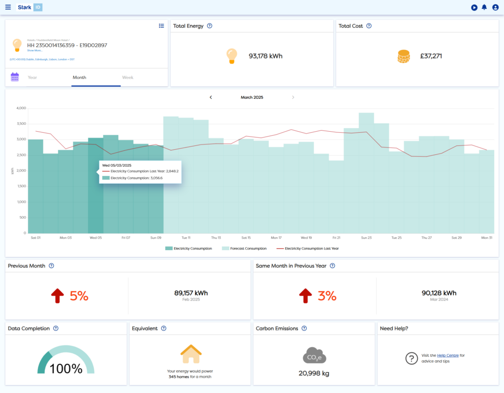
The Stark ID Dashboard is designed to give you an understanding of your site’s energy consumption for the current month, year or week across electricity, gas or water. The Dashboard can also be run for your whole company using reporting sets.
You can see your consumption, costs, carbon, energy performance and data completion all in one place – helping you discover more, with fewer clicks.
Running the Dashboard
The Dashboard report will automatically run when you select a data source.
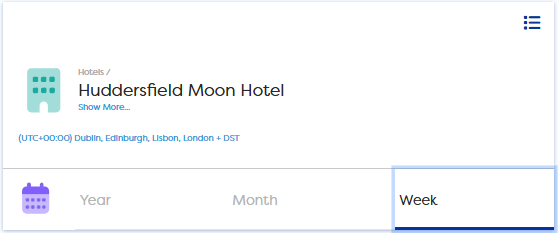
Navigating in the Dashboard and selecting your reporting period
Tabs
Switch effortlessly between the Year, Month or Week tabs located below your data source selection. Each tab will show a different amount of data for your data source.
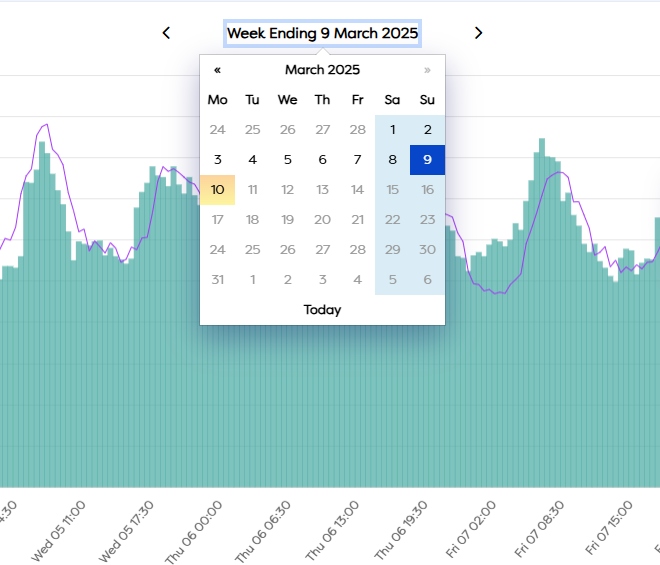
Changing the Date
To change the reporting period of the Dashboard, select the date label above the graph and choose the ending date for your report.
To shift your report to a previous or next period, you can use the arrows on either side of the date label.
Keep in mind that you will not be able to select a date in the future.
Running the Dashboard on large numbers of Data Sources
Please note that the Dashboard may take time to load when being run on larger data sets. Running 100 meters might take 5 minutes, whilst a thousand could take up to an hour.
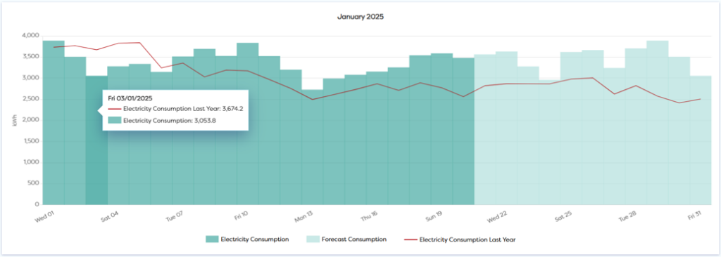
Reporting on your current period with forecasted data
For Year and Month reports including the current month, you’ll find forecasted data that allows you to review performance before the month-end. This forecasted data is calculated by using recent data from the same data source.
Tiles
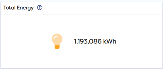
Total Energy for your report
In the first tile of your Dashboard, you’ll find your total consumption in kWh.
Cost on Dashboard Explained
The Cost tile gives you an indication of the costs associated with your energy consumption using a basic pence per kWh value. This will use an average value as a default and can be edited in Settings.
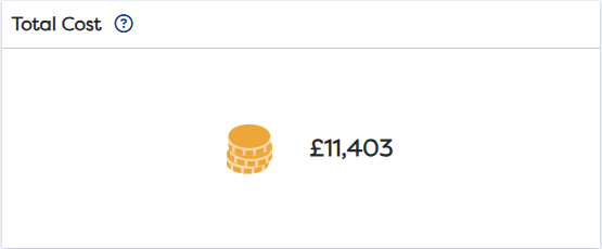
For more advanced Cost reports using your exact tariff information, you can enable Static > Cost reports.
For more information on how to enable this feature, please read this article:
Setting up your cost information – Stark ID Support
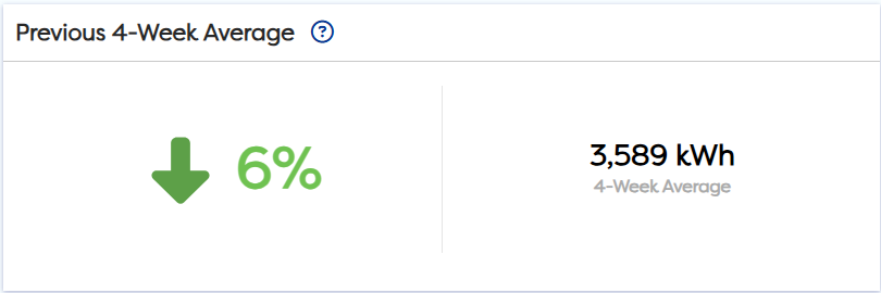
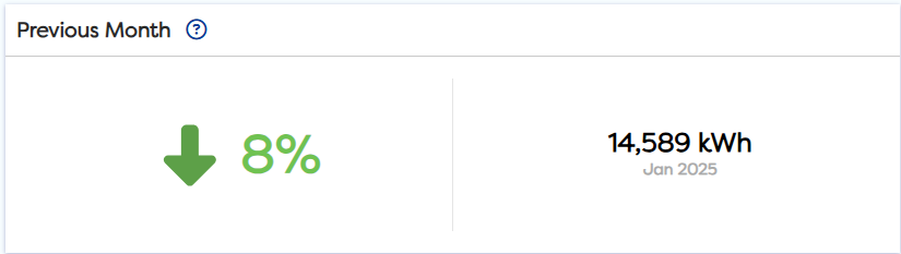
Your energy performance
To understand how your company, site or meter is performing, you can compare against similar periods.
For a week, the performance tile will compare against recent data using an average of the previous 4 weeks.
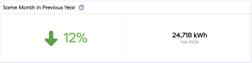
For a month, performance tiles will compare to the previous month and same month in the previous year.
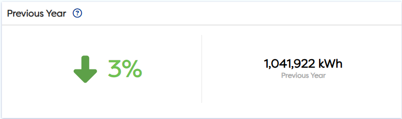
For a year, the performance tile will compare to the previous year.
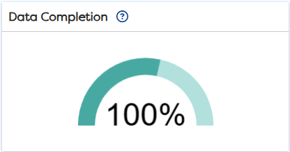
Data Completion Tile
The Data Completion tile shows how much data is actual, estimated, historical, missing or forecasted for your week, month or year.
The percentage KPI shows your Data completeness including actual, estimated, historic and forecasted. This will highlight when there is missing data so a percentage below 100% will indicate that there is missing data.
Hovering on each section of the bar will show you how much of your data falls into each category.
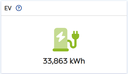
EV Tile Explained
When running the Dashboard on a site that has EV charge points the report will also include a tile displaying the consumption of your EV chargers
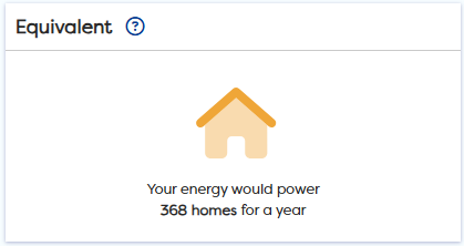
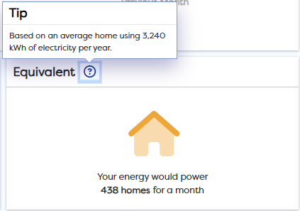
Perspective through Equivalents
Equivalents have been included to help provide perspective on consumption.
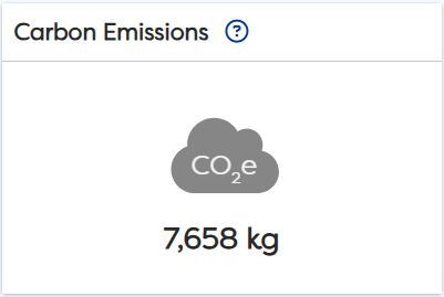
Carbon Tile Explained
The Carbon tile shows how much carbon has been produced by the consumption during the report period. The conversion factors being used are based on the UK governments Greenhouse Gas Protocol and more information on these can be found on the UK governments website.
To check which conversion factor is currently set for reporting, use the ? icon on the tile to reveal more information.
If in doubt, check the tooltip
Each of the tiles on the Dashboard comes with a question mark icon next to the header. Click on this to bring up more information on how this tile works.
Downloading the Dashboard
It is currently not possible to download the Dashboard from Stark ID.
Whilst not ideal, if you require a screen capture urgently then there are various browser plugins that can help you to download the Dashboard as an image.