Across various Static reports, you will often see an ‘Average’ line plotted on top of your energy consumption.
The average line generally appears as a black line.
In a static report, unless stated otherwise; the average line will represent a 4-week average.
4-week average
Typically, the most recent 4-week period is used to calculate the 4-week average. However, sometimes the 4-weeks that are averaged can differ depending on the period that you are reporting on.
In Weekly and Daily reports
The 4-week average is calculated by using the 4-weeks previous to the period shown in the report. With day reports, the previous 4 ‘similar days’ will be averaged.
For example, the below report has a report date of Friday 04/11/22. So the average that has been generated in the below report is an average of:
Fri 28/10/2022
Fri 21/10/2022
Fri 14/10/2022
Fri 07/10/2022

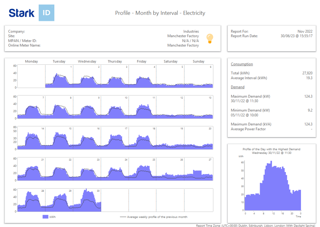
In Monthly reports
A calendar month report uses the 4-weeks prior to the report to calculate an ‘Average weekly profile’. The 4-week period being used is the last 4 weeks of the previous month.
This ‘average week profile’ is then overlaid on each week of the month report shown. The same average week will repeat.